BlogPost 78709781582 [Step-by-Step Guide] 5 Steps to a loyalty product your customers love
BlogPost 78699959693 The Big Debate: Is the future of loyalty point-less?
BlogPost 78241985154 Meet our Loyalty Panellist: An interview with Gianfranco Cuzziol, Group Head of CRM and Personalisation at Natura & Co
BlogPost 77796153192 Meet our Loyalty Panellist: An interview with Candice Lott, Owner Founder, We Are The Digital Type
BlogPost 77224734124 Meet our Loyalty Panellist: An interview with Robert Bates, Head of Decision Sciences at Currys
BlogPost 77127123068 Why I am proud to be a Badger
BlogPost 76608333841 Meet our Loyalty Panellist: An interview with Dave Robinson, Head of Customer Engagement Development at Boots
BlogPost 73886512190 Subscription is the new loyalty and other takeaways from HOSTECH 2022
BlogPost 71692924973 Fixing a complex problem like climate change with the circular economy and digital technology
BlogPost 71403547141 The cycle of breaking and fixing a complex problem like climate change
BlogPost 69261645950 [Infographic] What loyalty leaders have to say about loyalty programmes in 2022
BlogPost 70296739476 How service design is helping Anthony Nolan simplify one of the most complex processes around
BlogPost 68309340561 [Video] The future of digital loyalty: loyalty according to Generation Z
BlogPost 68313922388 [Video] The Future of Digital Loyalty: How Nando's meets the demands of Gen Z
BlogPost 68313921975 [Video] The Future of Digital Loyalty: Loyalty as a Service
BlogPost 66501854496 LGBTQ+ History Month: Championing Our Favourite Tech Heroes
BlogPost 62355809135 How to protect yourself from the next Log4j
BlogPost 29497396842 Slay corporate risk, innovate faster
BlogPost 60282037918 7 simple steps to perfect retrospectives to align teams on shared values
BlogPost 59002043050 How to bring product ideas to life: validating a potential solution to social inequality
BlogPost 58314159015 How to define and design a solution for a challenge like social inequality
BlogPost 58062863523 How Gen Z think about loyalty and why you need to align your strategy to meet their needs
BlogPost 57606948404 How to build a product organisation to tackle social inequality
BlogPost 57212425887 Pride 2021 & the Red Badger Social Value Taskforce
BlogPost 56886557469 The days of cloud vendor lock-in are over: the (continued) evolution of the platform
BlogPost 56269884829 Announcement: Olga Loyev promoted to Managing Director at digital product consultancy, Red Badger
BlogPost 51813452294 Align and integrate: how to cultivate loyal guests
BlogPost 51227324777 Test and learn: the fastest way to great guest experiences
BlogPost 51080694599 Standing out from the crowd: creating memorable customer experiences
BlogPost 50310902590 Own your guest experience: find balance between in-house and outsourced technology
BlogPost 49343210327 Strive for seamless: dissolve the data and system silos ruining guest experience
BlogPost 49334112107 Start small but think big: how to build a digital roadmap to seamless guest experiences
BlogPost 49687392573 David Wynne joins the Drum Digital Industries 2021 Awards judging panel
BlogPost 48627603635 Harnessing passion and purpose: lessons from those who’ve done it
BlogPost 48308343731 How to measure psychological safety
BlogPost 47319045542 Fostering digital innovation at the British Heart Foundation
BlogPost 47313050665 What qualifications are needed to work as the user experience expert
BlogPost 46981569105 Understanding Burnout and Anxiety - Lunch & Learn by Spill
BlogPost 46579599160 Can API Products help grow your customer base?
BlogPost 42531767343 International Women's Day 2021: Time to make an active choice
BlogPost 42443118417 How to launch a scalable optimisation programme for digital products
BlogPost 41519720290 The Role of People Experience Teams in Enabling Meaningful work
BlogPost 40953544500 Transitioning into QA- what I did to get there
BlogPost 41088270163 How product thinking can help solve society’s grand challenges
BlogPost 40768860874 6 ways to build an unproductive product team
BlogPost 40590579271 Teaching people with special needs how to code
BlogPost 40719553994 How to make good choices
BlogPost 40719898147 Customer empathy: How my invisible experiences became very visible with one small change
BlogPost 40719277123 Top 7 things that bring customer value... from an engineer who builds it
BlogPost 39026897060 Learning to adapt
BlogPost 39696540399 How to talk about race?
BlogPost 38609734245 Introducing an Agile Delivery Framework to the public sector
BlogPost 38609733777 Designing for complexity: Delivery Framework for the Government
BlogPost 38610335989 Running a remote North Star
BlogPost 37820890926 Avoiding testing bias with a small pool of users
BlogPost 37456752474 Harriet Green joins Mission Beyond and Red Badger
BlogPost 37446347859 Stop talking. Start doing. Why I’m with Tech Charter in the drive for a more diverse workspace
BlogPost 37103333130 How screen reader testing improved both code quality and accessibility
BlogPost 35961228517 Dream bigger than you are: key highlights from our second Mission Beyond
BlogPost 35691868290 Mission Beyond: How businesses can work together to improve social mobility
BlogPost 35480928575 Working in the open with FutureNHS
BlogPost 34985599211 8 principles to guide your tech choices
BlogPost 35181164126 Mission Beyond - a follow up Q&A with Matthew Syed
BlogPost 35078649806 Think Outside The Building
BlogPost 35047791991 Your chances are half mine
BlogPost 34190379057 The RAT: Your product's new best friend
BlogPost 33570213774 Boel Ferguson, ex VP & GM of Disney Interactive EMEA & UK joins Red Badger as an Executive Board Advisor
BlogPost 33203067892 Lift off! The Launch of Mission Beyond
BlogPost 32481724239 Cain Ullah, CEO of Red Badger joins 20-first, a world-leading gender balance consultancy, as an advisory board member
BlogPost 30592014950 a11y* is your ally
BlogPost 30007676315 Product Thinking
BlogPost 30001701670 Putting purpose at the heart of business
BlogPost 30016229134 What Marcus Aurelius can teach us about product development in a time of crisis
BlogPost 29974722327 Mission thinking: embracing an experimentation mindset to accelerate growth at scale
BlogPost 29654889088 New product development in a brave new world
BlogPost 29618767657 Building Post Pandemic Foundations - The Role of People, Practices and Purpose
BlogPost 29495568652 Innovation; collaboration of diverse minds to solve the greatest challenges
BlogPost 29337544255 One minute reads: forecasting with Little’s Law
BlogPost 29080213936 Two world-leading experts in the field of gender balance and purpose-led business practice join Red Badger’s Advisory Board
BlogPost 29110004866 Our Badger Apprentice is listed in the BIMA100
BlogPost 29079606470 NHS England partners with Red Badger for the redesign of FutureNHS collaboration platform
BlogPost 28679793198 One minute reads: has the Test Pyramid outlived its use?
BlogPost 28569992115 Fail small to win big
BlogPost 28873458419 ShareThyme selected as an honourable mention in Fast Company's World Changing Ideas Awards
BlogPost 28570297856 One minute reads: getting value from data
BlogPost 28570370190 One minute reads: data-driven design
BlogPost 28570297798 One minute reads: a North Star in product delivery
BlogPost 28570297902 One minute reads: mobile conversion rates
BlogPost 28569992524 I still haven’t found what I’m looking for: improving internal search
BlogPost 28426241934 Extending Istio with Rust and WebAssembly
BlogPost 27817680656 12 of the Best April Fool's Products
BlogPost 27121100366 MTTR - the most important metric you might be ignoring
BlogPost 26852471250 Supporting disabled people into employment is an opportunity for everyone
BlogPost 24765233563 Discovering DSDM
BlogPost 24961770155 What’s the mission beyond your product?
BlogPost 24306570437 Product is an ecosystem not an end result
BlogPost 21772550764 Calculating your carbon footprint - a how-to guide
BlogPost 22330211217 Now is a really good time to make friends with Rust
BlogPost 21884109672 What did we learn at the Mental Health First Aider training?
BlogPost 19494344338 The ultimate baking competition with ShareThyme’s ambassadors Val and Selasi
BlogPost 18790604939 How fast can you move from an impactful idea to a live product?
BlogPost 18591739667 Red Badger ranks Nr.47 in Econsultancy’s Top 100 (again!)
BlogPost 14568024608 Finding joy in uncertainty - Learning to ‘Improv your life’
BlogPost 12234187797 How developing my first web page changed my life
BlogPost 12696950494 ShareThyme launches competition with new ambassadors Val and Selasi
BlogPost 11844799243 Innovation (without the) Lab
BlogPost 11385539275 Red Badger launches ShareThyme – an innovative new platform
BlogPost 10153796296 Red Badger journal - My first week
BlogPost 9888543248 Monorepos, lifelong learning and ways of working - here's what our tech director Viktor has to say
BlogPost 9891940933 Here’s what we learnt about moving at light speed with continuous delivery
BlogPost 9595124815 Building trust for 9 years and counting
BlogPost 9497009584 We are just 1 year shy of a decade of Badgeriness
BlogPost 8817794506 Engineering culture - The key to successful digital delivery
BlogPost 8818297753 Long live Helvetica, choosing the right tech, and stock photos
BlogPost 8653331896 Robots, voice grocery shopping, and volume control gone wrong
BlogPost 8480429300 Apple news, fresh job titles and tackling loneliness with tech
BlogPost 8162699176 Your friend the impostor
BlogPost 8321979368 Creative youngsters, AI art tools, new records for Pi and the happiest nations ranked
BlogPost 8285481447 Why don’t you have a monorepo?
BlogPost 8002011735 Gender equality in tech, running over Grandma, and living pre-Google days
BlogPost 7887057844 Value, digital diets, and utilising the power of Shruggie
BlogPost 7738289651 Design trends, smart speakers, and the Dvorak keyboard
BlogPost 7547126495 We’ve just launched our new TechLab_Report 19 - our view on what matters in tech
BlogPost 7592632136 Digital detoxing, making dark mode themes, and a 90s throwback
BlogPost 7469409594 New emojis, Facebook at fifteen, and spreadsheet collecting
BlogPost 7353727442 Emotions, Google, and a tone deaf quiz
BlogPost 7288540147 Mobile First - 5 key learnings of using React Native
BlogPost 7239896193 Fake internet, folding phones, and focus groups
BlogPost 7130285600 The magic of 9:41am, a new research approach, and the ten year challenge
BlogPost 7036752042 12 days of Red Badger - Our 2018 in review
BlogPost 6927226403 Content Management Systems are Change Management Systems
BlogPost 7019119867 End the UI vs UX war, CES gizmos, and getting an email just right
BlogPost 6916225492 Apps to change you, getting things done, and agile resolutions
BlogPost 6841491217 Scientific tree decorating, UX 2019 predictions, and AI Christmas tunes
BlogPost 6832407486 100% off free advice on deep discounting
BlogPost 6830162297 Retailers: Your customers are cheating on you
BlogPost 6775107746 Design ethics, luxury retail, and illustrating Slack
BlogPost 6657238922 Rage against the machine learning
BlogPost 6718475619 Businesses’ pivot to tech, fax machines, and accessible Instagram
BlogPost 6666710600 Fail hard, learn fast
BlogPost 6647739787 The missing headphone jack, notifications, and the eye of a designer
BlogPost 6570221896 Power Hour at Red Badger
BlogPost 6588205052 Digital transformation, the little things, and sitting right
BlogPost 6490779468 Building great products with the best minds in Silicon Valley
BlogPost 6528869234 Diversity, mouse cursors and the sound of Mars (the planet not the chocolate bar)
BlogPost 6477298758 Preserving the fruits of JAM
BlogPost 6477270548 Emotions, data, and a new kilogram
BlogPost 6666806605 How cross-channel analysis can improve customer satisfaction
BlogPost 6464820354 I did good - A simple way to celebrate success
BlogPost 6464819238 Red Hat, cats, and agile gone awry
BlogPost 6467318644 How Amplitude will help you with data-driven product optimisation
BlogPost 6464816360 Quitting QWERTY, doing better, and new Adobe updates
BlogPost 6377738757 Former MD of Visa UK & Ireland and Director of Innovation at Goldsmiths join Red Badger advisory board
BlogPost 6377742648 New badgers, calendar design, and the ever-growing internet
BlogPost 6347881647 Programming a quantum computer: generating true random numbers
BlogPost 6347881747 Return of the badger intern
BlogPost 6347880159 Netflix, new banks, and how your mother uses the internet
BlogPost 6348290892 Redesign of the Sun Savers app
BlogPost 6348290841 Planning for disruption, first UXD jobs, and Knuckle Tattoos
BlogPost 6348290744 Don't get mad, get even. My view on diversity and inclusion.
BlogPost 6348290654 Remembering our friend and fellow Badger, Natalie
BlogPost 6347881722 Better decisions, Open Banking, and our latest ranking
BlogPost 6347881696 Red Badger is Amplitude’s first UK partner
BlogPost 6347881623 A labour of love – delivering a flagship, best-in-class digital experience for the Pride in London community
BlogPost 6347881671 We’re part of the ‘FT Future 100 UK 2018’ list
BlogPost 6347881593 Emojis, fonts, and design tips
BlogPost 6347881573 Innovative design, smart speakers and Netflix to chill
BlogPost 6348295565 Mobile Metamorphosis
BlogPost 6348295701 SoDA Lessons in Leadership and Empathy
BlogPost 6347881733 London tech, Google Chrome hits ten and design thinking backlash
BlogPost 6347881529 Diversity, digital novels and colour searching
BlogPost 6347881523 Scaling up, talking design and an AI visualiser
BlogPost 6347881535 React Native: A Checkbox Story
BlogPost 6347881512 Family computers, dev languages, and client briefs (Not the underpants)
BlogPost 6347881503 We’re proud to announce we’re on G-Cloud 10
BlogPost 6347880770 Automate non-functional tests with Puppeteer and Lighthouse
BlogPost 6347881556 Rubik remade, storytelling and user experience, and a round of applause for variable fonts
BlogPost 6347881447 From belly to brain: Turn gut feelings to explanations using Kanban
BlogPost 6347881520 Firefox changes, meaningful work, and Agile in the real world
BlogPost 6348294038 Cloud, automation, and accessible gaming
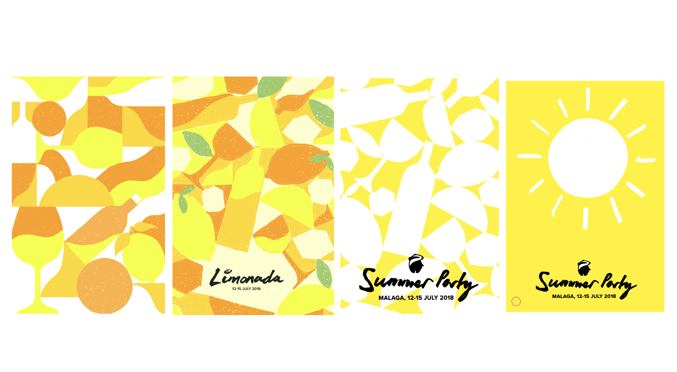
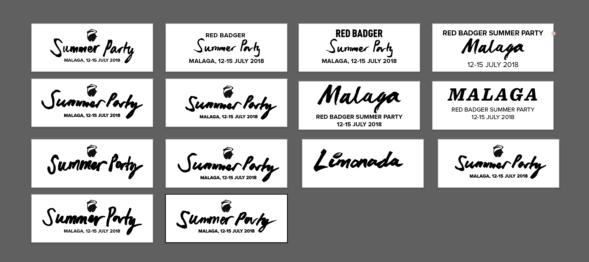
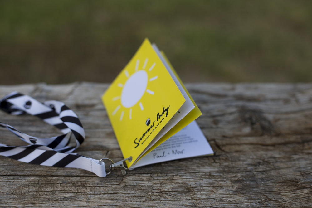
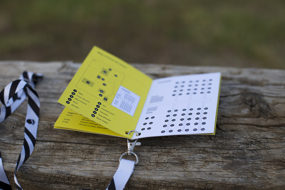
BlogPost 6347881391 When life gives you lemons… you throw a party
BlogPost 6347881267 Why Prettier is already adding value and being adopted fast.
BlogPost 6347881028 How ReasonML may become the key to writing future React applications
BlogPost 6348293897 Elm, what does the future have in store?
BlogPost 6347881224 Why Pipeline as Code is adding value.
BlogPost 6347881054 Looking to try CSS in Javascript? Have a read to see which approach to take
BlogPost 6348293922 What's Infrastructure as Code (IaC)?
BlogPost 6347881358 We're BIMA finalists for the 'Transformation & Consultancy: Impact' Award
BlogPost 6347881138 Microplatforms. The best enabler of continuous deployment ever.
BlogPost 6347880633 Programming, Pride, and Pokémon - Two weeks at Red Badger
BlogPost 6348293884 Automating tasks and tests with Headless Browser Testing
BlogPost 6347881080 Machine learning: Surpassing humans in quality? Or still subject to "human error"?
BlogPost 6347880989 How continuous deployment boosts productivity beyond just your technology team
BlogPost 6347880671 The man who made the net, digital payments, and open offices
BlogPost 6347880892 Building scalable and maintainable applications with Elixir
BlogPost 6347880598 Product Thinking, Happy UX, and Team Psychology
BlogPost 6347880713 Ampersand Conf – what typography can do and where it might be going
BlogPost 6347881488 Open source, Pride, NHS, security and agile crisis management
BlogPost 6347880485 A labour of love
BlogPost 6348293377 Calm design, open source, Cannes Lions and green IT
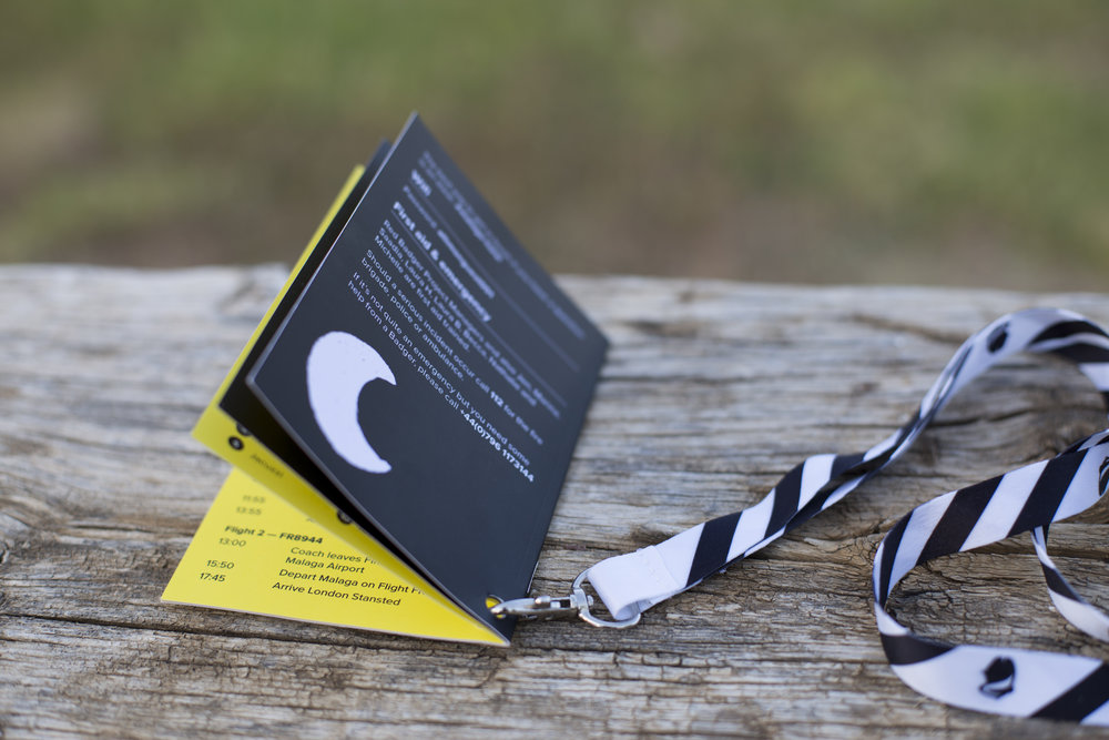
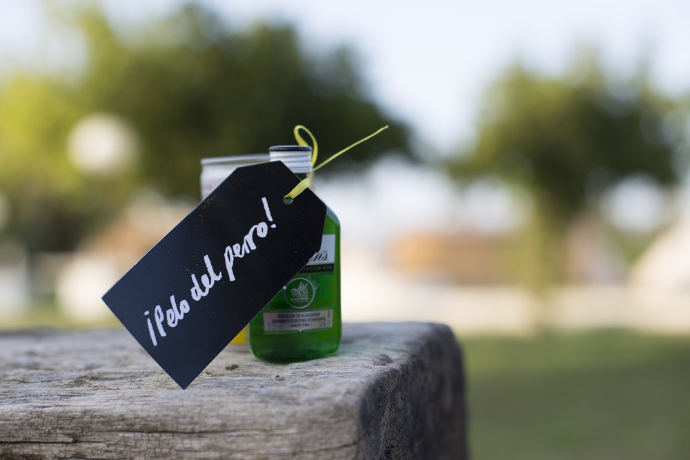
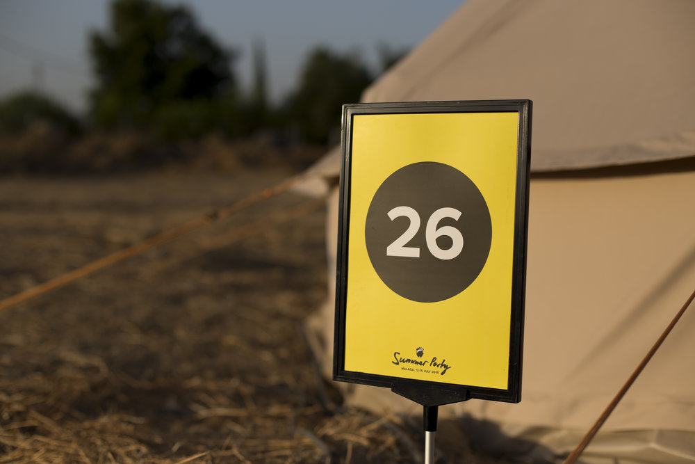
 Branding the Summer party 2018