Accessibility is a massive topic, and, if you are a developer who doesn't have much control over the designs, it can feel like a lot of it is out of your control. With a few simple coding cha
In this blog post I will walk you through how I approach making an existing feature accessible in three steps:
- Use semantic HTML
- Announce changes
- Force the tab focus
Accessibility is a massive topic, and, if you are a developer who doesn't have much control over the designs, it can feel like a lot of it is out of your control.
With a few simple coding changes, we can make our features accessible to the following users:
- Users who listen to pages using a screen reader
- Users who navigate pages only using a keyboard
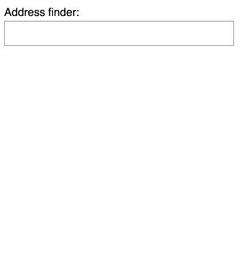
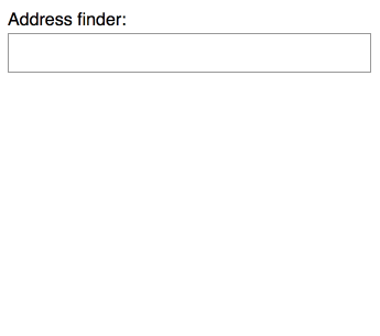
The address finder feature
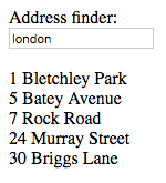
Below is a gif showing how my address finder works. Underneath, I explain what is shown in the gif as an example of 'alternative text', which is essential for accessibility.
 The gif shows a user clicking on an input box labelled 'address finder'. The user types 'london' into the input box. A drop down appears showing 5 results, and an 'x' icon appears on the right hand side of the input box. The user selects the result '24 Murray street'. The results dropdown vanishes, and 24 Murray street appears in a grey box below the input box. The user types into the input box again, then clicks the 'x' icon to demonstrate how the input field clears and the results vanish.
My address finder is a very simple mock feature written in react. The GitHub repository has a branch for every step of the code, and instructions on how to run the code and try it for yourself.
You can view the first iteration of the address finder code on GitHub. It works(ish) - but it is completely inaccessible.
How do I know my feature is inaccessible?
I can run the chrome accessibility audit but this gives me a pass of 94% on my original version of the app. This is because it only checks the state of the feature as is - it doesn't try and interact with the feature at all. The best way to test for accessibility is through manual testing.
Testing as a keyboard-only user
It is very easy to test if a feature is accessible to keyboard only users - stop using your mouse or trackpad. You can navigate through a webpage by using the tab key to jump to the next interactive element, and then enter to trigger the link. You can press shift and tab to go backwards. One example of a good keyboard-only experience is the BBC website.
If you run my address finder code you'll notice that you can tab to the input box, but not to the clear button, '1 Bletchley Park' or any of the other address results. In order to select an address, you need to be able to click on it. This is unusable without a mouse.
 The gif shows the user tabbing to the input box, the results appear, but when the user presses tab again it skips over the content and goes to the next interactive thing: the browser search bar.
Testing using a screen reader
On my work MacBook I use the built in VoiceOver screen reader. Once it is turned on with cmd f5, I listen carefully for more commands, and use the tab key to navigate around.
This gives me an idea of what my website sounds like. Ideally, I'd like to test on multiple different screen readers and to run user testing sessions with people who use screen readers every day.
People who rely on screen readers have their own, much more efficient ways of navigating with a screen reader than tabbing through the content. Still, a rough idea is better than nothing.
Here is a recording of what the address finder sounds like as I try to use the address finder.
I can find the input box and type into it - my typing isn't spoken aloud - and then... silence. I don't know if there are any results. I can't tab onto them to read them. I don't even know if there are any results to be found. It is unusable.
So, how do I make this feature accessible?
I have broken this down into three easy steps:
- Use semantic HTML
- Announce changes
- Force the tab focus
Each step explains techniques that can be applied to any feature in your codebase.
Step one: Use semantic HTML
Writing semantic HTML means using HTML tags that indicate the content itself. This may be as simple as changing:
<span class="cm-tag cm-bracket"><</span><span class="cm-tag">div</span><span class="cm-tag cm-bracket">></span>My page title<span class="cm-tag cm-bracket"></</span><span class="cm-tag">div</span><span class="cm-tag cm-bracket">></span>
to
<span class="cm-tag cm-bracket"><</span><span class="cm-tag">h1</span><span class="cm-tag cm-bracket">></span>My page title<span class="cm-tag cm-bracket"></</span><span class="cm-tag">h1</span><span class="cm-tag cm-bracket">></span>
Screen readers use HTML tags to understand the content itself. Now it knows 'My page title' is a <h1> it can tell the user that helpful information.
If you can remove all the CSS and images on your page and your page still makes sense, your HTML is semantic
This is how my address finder looks like without CSS and images:
If the page was presented to you like that, you probably wouldn't assume that '24 Murray Street' and the other results are interactive.
Making elements look interactive
My first step is to change all those result divs to button elements. Screen readers and browsers know that a button is an interactive element, so the user will be able to focus on them with the tab key and the screen reader will be able to tell the user how to press them. An <a> element would have a similar effect, but implies a jump to a different section rather than a change within the page.
I made a few more changes, and you can view the more semantic version of the address finder code on my GitHub pull request. I have added multiple comments to explain each new addition, and the impact they have on accessibility.
This is how my address finder looks without CSS and images now:
This is now what it sounds like when I tab to the input box, search for london and then tab to the clear button and through each of the results. I can now click on '24 Murray Street'.
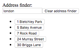
This gif demonstrates how the user is now able to tab through each interactive button:
 The gif shows the user typing 'london' into the Address finder input box. They then tab onto the clear button, then each of the address finder results. They select '24 Murray Street'
Step two: Announce changes ✨
Semantic markup has already improved the experience, the user can now access everything they need to. The next step is to make sure the user knows when there are new things for them to access.
In the address finder example, there are three key changes:
- The address finder results have loaded
- You have successfully selected an address
- The address finder has failed and thrown an error
At the moment, the user will not get any notification from their screen reader when these changes happen. This can be fixed using attributes that are specifically for accessibility - these are called ARIA attributes.
Announcing an error
My (mocked up) error state works like this:
 The gif demonstrates the error state. The user types the word 'error' into the address finder input field, and a red box appears below with the message 'Something is wrong!'.
The error itself is a simple div:
<span class="cm-tag cm-bracket"><</span><span class="cm-tag">div</span> <span class="cm-attribute">className</span>=<span class="cm-string">"error"</span><span class="cm-tag cm-bracket">></span>Something is wrong!<span class="cm-tag cm-bracket"></</span><span class="cm-tag">div</span><span class="cm-tag cm-bracket">></span>
All I need to do is inform the screen reader that this is an alert - information the user needs to be aware of immediately.
I add role="alert" so my code now looks like this:
<span class="cm-tag cm-bracket"><</span><span class="cm-tag">div</span> <span class="cm-attribute">role</span>=<span class="cm-string">"alert"</span> <span class="cm-attribute">className</span>=<span class="cm-string">"error"</span><span class="cm-tag cm-bracket">></span>Something is wrong!<span class="cm-tag cm-bracket"></</span><span class="cm-tag">div</span><span class="cm-tag cm-bracket">></span>
role="alert" actually interrupts the screen reader to tell the user about this new element on the page.
Below is a recording of what it sounds like when I type the word 'error'. You can hear it start to read out the results - but then be interrupted by the error itself.
The role attribute is just another way to inform screen readers what an element is - an alert, a tab, a tooltip. You can read about all the options on the w3 specification for the role attribute.
HTML5 tags are actually shorthand ways of writing role attributes, for example:
<span class="cm-tag cm-bracket"><</span><span class="cm-tag">nav</span><span class="cm-tag cm-bracket">></span>My navigation<span class="cm-tag cm-bracket"></</span><span class="cm-tag">nav</span><span class="cm-tag cm-bracket">></span>
Could also be written as:
<span class="cm-tag cm-bracket"><</span><span class="cm-tag">div</span> <span class="cm-attribute">role</span>=<span class="cm-string">"navigation"</span><span class="cm-tag cm-bracket">></span>My navigation<span class="cm-tag cm-bracket"></</span><span class="cm-tag">div</span><span class="cm-tag cm-bracket">></span>
Announcing the address finder results when they come in
It's rude to interrupt people - so only use the alert role for information the user needs to know immediately. We still want to announce when we have successful results, whether it is currently in the page like in the example, or if we get results from an API. We want to do this in a polite way. We can mark a section of the page as a section that will change, and ask the screen reader to tell the user about any changes within this section. This is called a 'live region'.
<span class="cm-tag cm-bracket"><</span><span class="cm-tag">div</span> <span class="cm-attribute">aria-live</span>=<span class="cm-string">"polite"</span><span class="cm-tag cm-bracket">></span>This area will change! {...results}<span class="cm-tag cm-bracket"></</span><span class="cm-tag">div</span><span class="cm-tag cm-bracket">></span>
The aria-live attribute indicates a section where the contents will change. The polite means that the screen reader will wait until it has finished what it was saying before announcing the new content.
I have wrapped my live region around both the results list and the chosen address container. It will now announce the results and the chosen address when they appear.
This is what it sounds like when the user types in london and then goes through to select '24 Murray Street'
You can read the code changes for announcing content on my GitHub pull request.
Step three: Force the tab focus
The last technique I will walk you through is forcing the tab focus, so you can jump the user's focus to a relevant interactive element. This can be helpful in all sorts of ways - one of the most common examples is a 'skip to main content' link.
A skip to main content link is a hidden link that takes the focus straight to the main content. The user can use this link to jump over navigation lists which have a lot of links to tab through. You can see this feature on the BBC website - it appears when you only use the tab key to navigate.
For my address finder, I will put the focus back on the input box after the user has pressed the 'clear address finder' button. This is a small detail, but I feel like it makes the whole experience nicer.
 The gif shows the user tabbing into the address finder input box, typing a few letters, tabbing onto the close button then it shows the blue focus outline around the input box again.
You can see how I implemented the force focus on GitHub.
That's it!
I hope this has given you some ideas for how to make your own features accessible.
What do you think of the final experience? How would you change it to make the experience better? I have built this example assuming that a software engineer is not allowed to change the visual design of the feature. If you are allowed, what do you think you would change? Have you noticed any improvements to the overall experience, when you are navigating with a mouse or without a screen reader? Now you understand how to make something accessible, how would you approach writing a new feature?
We're always looking to improve here at Red Badger, let us know what you think! You can tweet me directly @zoeabryant on Twitter.
You can also hear me discuss accessibility as a wider topic on the Radio Badger podcast.